

Monterrey University Wayfinding System Design
Monterrey University Wayfinding System Design
1. Importance Overview
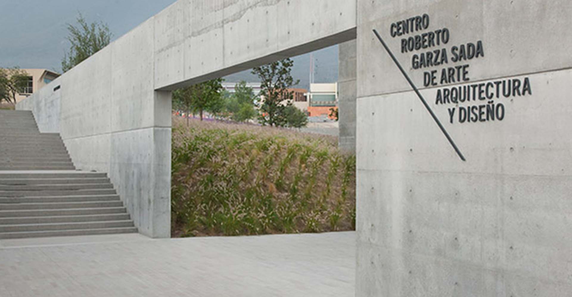
Key Role: The wayfinding system at Monterrey University prioritizes clarity and efficiency, providing seamless navigation for students, faculty, and visitors. Its cohesive visual language enhances spatial readability while reinforcing the campus’s contemporary academic environment.
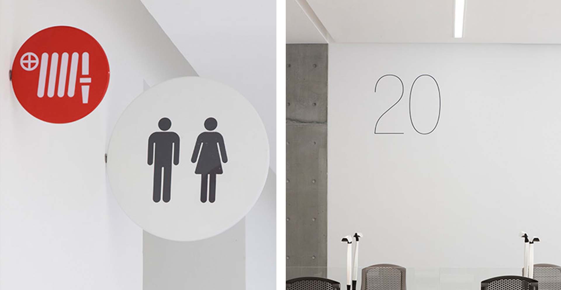
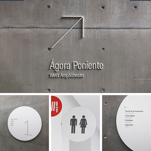
Unique Value: The system balances functionality and artistry—such as restroom signs with minimalist lines—meeting practical needs while complementing campus architecture, embodying a "less is more" approach.
2. Design Features
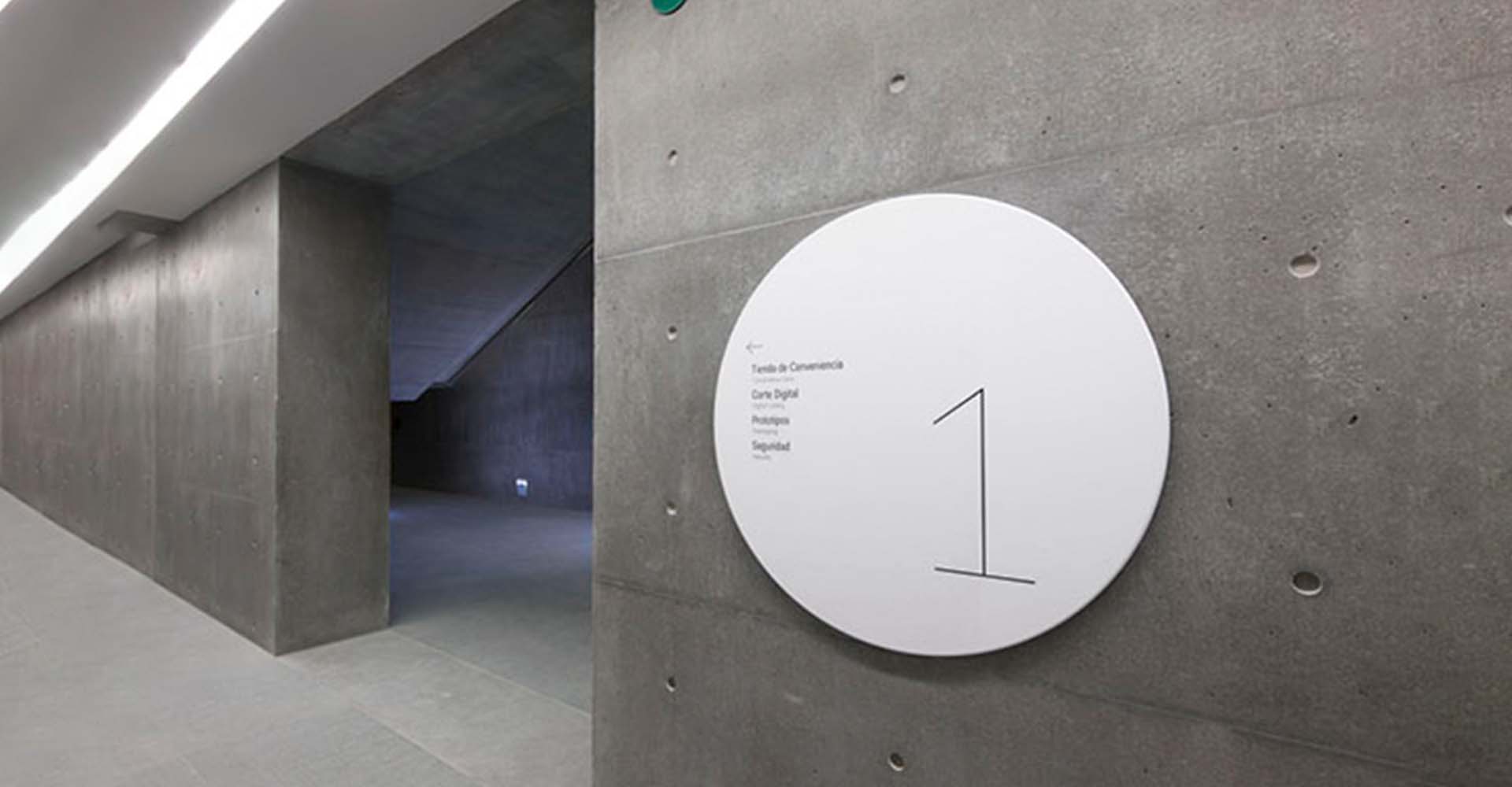
Minimalist Signage: Restroom signs use clean lines and universal symbols for instant recognition across languages and cultures, aligning with the campus’s modern aesthetic.
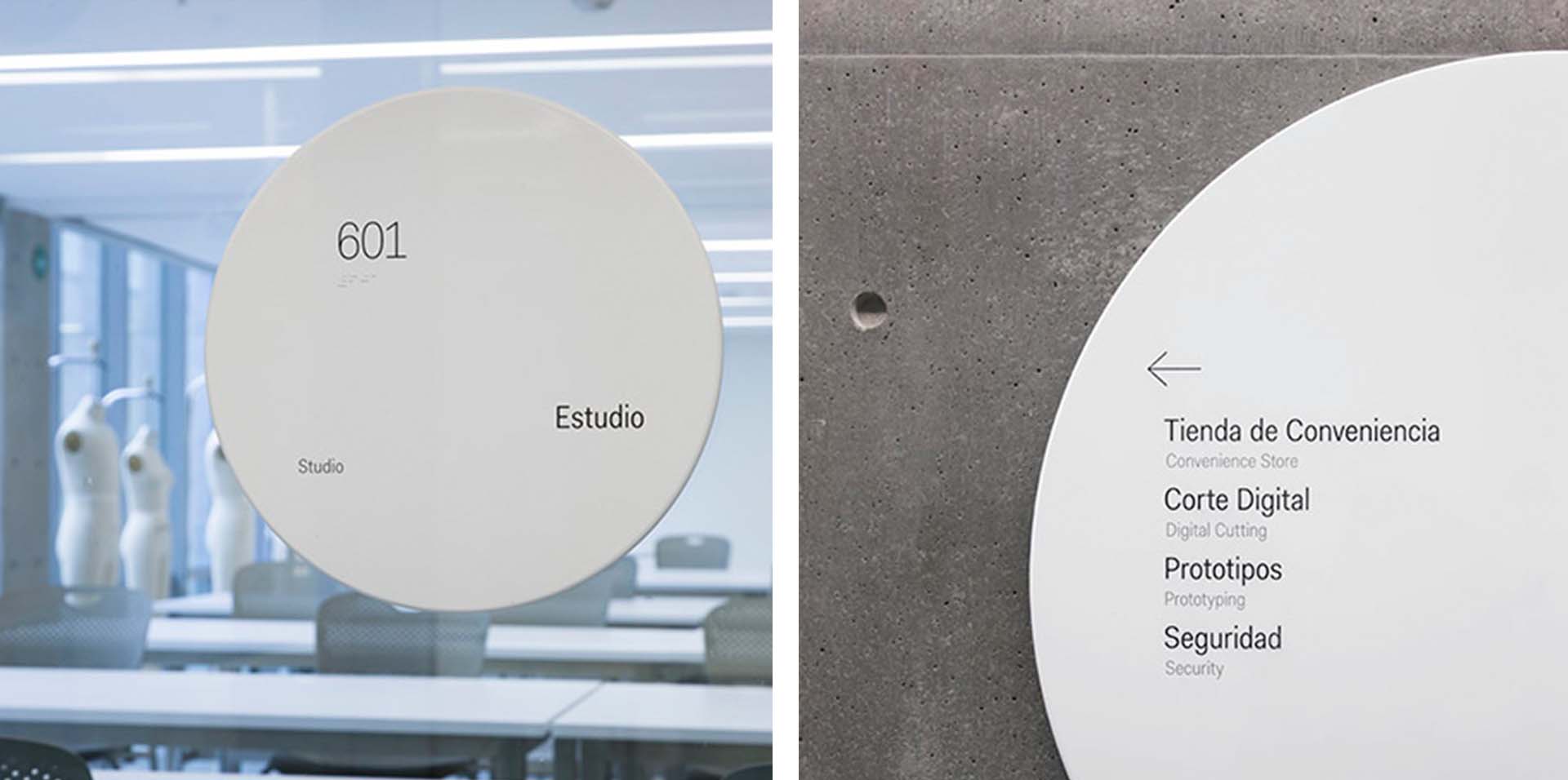
Contrast: The use of white lettering, sleek white discs and glass mirrors contrasts strongly with the rough grey concrete walls, making the signage more eye-catching and prominent in the minimalist architectural environment.
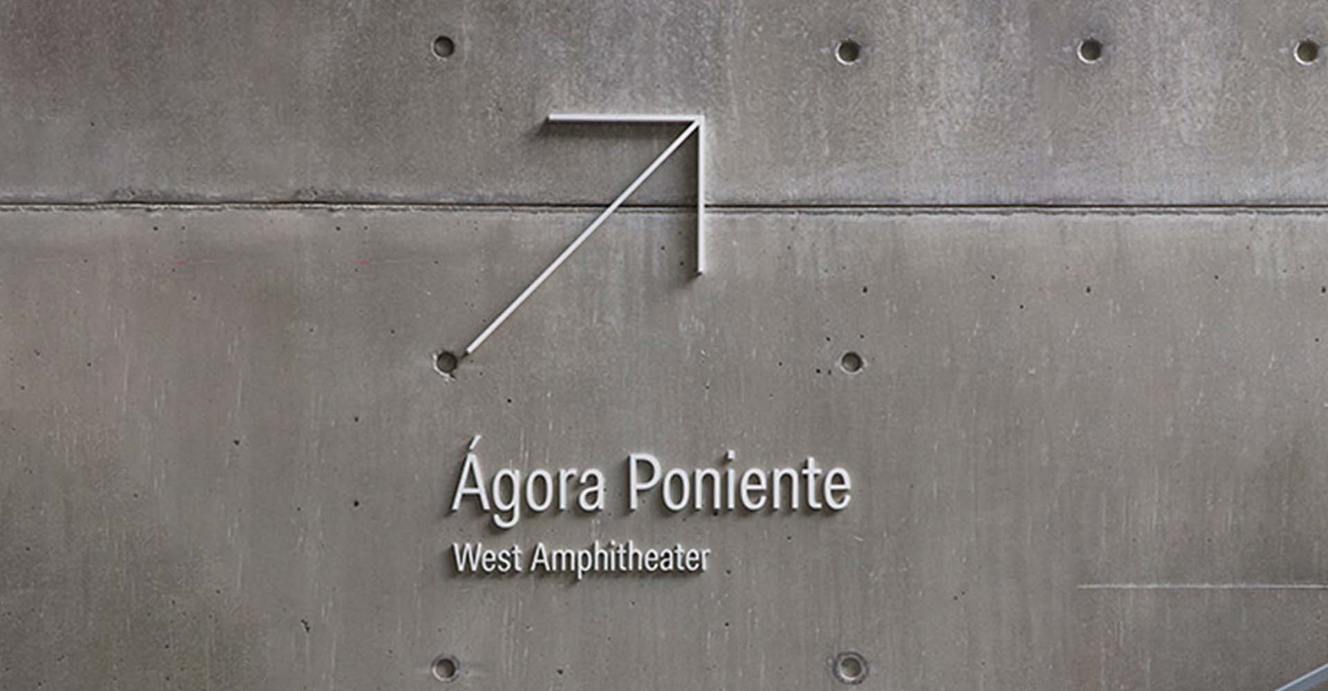
Multiple installation methods: A variety of technologies are used to fully integrate the wayfinding system into the building, such as the iconic lettering nailed directly to the concrete wall, and the studio space signage is printed directly on the wall using oversized silk screen, making the wayfinding system a part of the building.
3. User Experience
Efficiency & Inclusivity: Users report that minimalist design reduces cognitive load, while bilingual labels and symbols improve accessibility.
Cultural Resonance: Naming landmarks after local figures fosters pride in campus heritage.
Dynamic Adaptability: Modular panels support temporary updates, ensuring longterm relevance.
(This article focuses on case sharing and provides an in-depth analysis of practical experiences for you.)
Case Interpretation Designer:
Myra
Publisher:
Charcy
Recruit:
We will regularly find and share global high-quality sign cases,
if you have a better case or project,
you can send it to us, we will share your case with more people.
 Chaplin College Wayfinding Sys
 Monterrey University Wayfindin
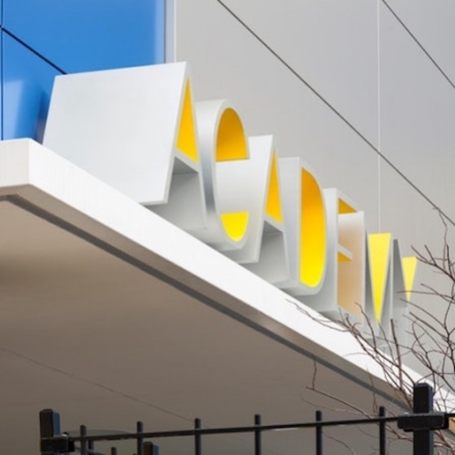
 AMISTAD Academy Wayfinding Sys
 PAVE Private School Wayfinding